The Evolution of Google Local Results and Mobile

I first got into SEO back in 2009. In SEO years, that makes me pretty old. During that time, I’ve had a strong interest in the local landscape, including local changes and updates and the impact they had on local businesses. In 2013, local results started changing significantly. Around this time, Google also started caring about the mobile experience a little bit more, which got me thinking. Are the local appearance changes related to the increase in mobile usage? In this article, I will attempt to outline the updates I consider the biggest and most important for mobile and local results and see if I can make a correlation.
Local Carousel — June 2013
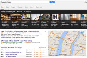
The local carousel is one of the first “big” changes to the appearance of local search results that I remember.
 For certain local searches, like restaurants and hotels, a horizontal list with as many as 20 businesses appeared at the top of the search results. Google reasoned that compiling a list of local businesses with reviews would help users better sort through the data.
The carousel was short lived and only lasted about six months. By November 2013, Google had already dropped this kind of search result for local businesses.
Hummingbird — September 2013
Hummingbird wasn’t so much an update as a “new engine” or overhaul in how Google looked at search queries. Google got better at recognizing contextual searches and matching longer search queries to appropriate and relevant websites.
I believe Google did this, in part, to cater to the way mobile users were searching.
Instead of typing in “plumber Lehi UT,” a user might have asked his or her phone a question like “Who is the best plumber?” or “What plumbers are close to me?” Google needed to understand whole phrases and the context of individual words in those phrases to provide the best results.
Keyword searches over time have become longer, and Hummingbird changed the way Google understands these long searches. I believe Hummingbird benefited both desktop and mobile searches, but I also think the update happened in anticipation of and in reaction to the increase in mobile usage.
Authorship Change — June 25, 2014
This update involved simplifying authorship tags and is tricky to explain in depth. However, the reasoning behind this simplification is important to understand.
John Mueller, an official Google representative, stated in June 2014:
“We’ve been doing lots of work to clean up the visual design of our search results, in particular creating a better mobile experience and a more consistent design across devices. … (Our experiments indicate that click-through behavior on this new less-cluttered design is similar to the previous one.)”
This comment has two important takeaways:
- Google was concerned for some time about improving search results for mobile devices.
- A better visual experience for mobile users required “less clutter.”
Google took a small step toward an improved visual experience for mobile users with this authorship change.
Pigeon — July 24, 2014
Pigeon was more than just a visual change. It was also an algorithmic one. In fact, it’s the largest local algorithmic update to Google that I can remember. Google changed some of the factors it considers when ranking local search results in both the maps and organic sections.
Some important takeaways from this update:
- It affected both Google Maps search and Google organic search.
- It produced results more closely related to traditional ranking signals.
- It made directory websites more prominent.
Local maps always depended on “NAP”—a business’s name, address, and phone number. Google wanted to make sure that business information was consistent across the board. “NAP” is definitely still important, but so are the traditional ways of ranking for an organic search.
Traditional ways of ranking boil down to authority and relevance. A website owner builds authority through links and relevance through onsite content. Pigeon required websites to produce quality content and attract quality links to increase their chances of showing up in Google Maps results.
Directory websites, which compile a list of websites in a particular category, became more prominent in search results, especially if Google thought a user was looking for a list.
If a user typed in something like “plumbers,” Google reasoned that the user wanted a list of plumbers, and directory websites provide lists. Websites like Angies List, Yellow Pages, and Yelp started showing up a lot more in local searches.
Mobilegeddon — April 21, 2015
Mobilegeddon received its name mostly because of its anticipated impact. On February 26, 2015, Google sent out a message informing webmasters and websites that mobile friendliness would affect search results starting on April 21, 2015.
While the update didn’t cause as much of an impact as most people thought it would, Google sent a clear message that mobile friendliness mattered.
Local 3-Pack — August 2015
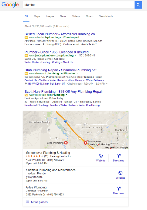
 In August 2015, Google changed the Google Maps listings from five results to three. If you owned a business with a fourth or fifth result, this was not a welcome change.
Note the change in appearance, not just the reduction in the displayed results. The “More Places” button at the bottom is much more prominent and inviting to click on, especially on mobile devices. The Local 3-Pack update might be the first local change where I saw an immediate connection between local changes and mobile.
The change catered to mobile devices, and to make its design consistent, Google also made the change to its desktop results.
Business Details Removed from Google+ Local Pages — November 2015
In November 2015, Google changed the information visible on a Google+ page.
Mamta B. from Google stated, as part of a transcript in a help forum:
“We found that Profiles and Pages were easier to understand if presented in the same style, and we’ve simplified both in the same consistent way. The following features are no longer supported for Local pages—reviews, categories, directions, stars, photo uploads, interior photos, maps, hours, OpenTable/apps integration.”
At first, this update might seem a little confusing—aren’t reviews and similar information important to users and businesses? I would like to point out a similar concept I mentioned when Google implemented visual changes for mobile searches.
“Less clutter.”
 Through all their data, Google has determined that users like simplified design and less information while on mobile devices. Google still provided all the information users wanted, just in a mobile-friendly way.
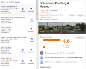
While the changes affected the information displayed on Google+ pages, that information still appears in Google searches. The result above shows what happens when you click on “More Places.”
There isn’t really a way to navigate to the actual Google+ page from Google search results. However, users see a prominent button to visit the company’s website. This design speaks to the goals of the Pigeon update: traditional factors matter more in a local Google Maps result.
AdWords Change — February 2016
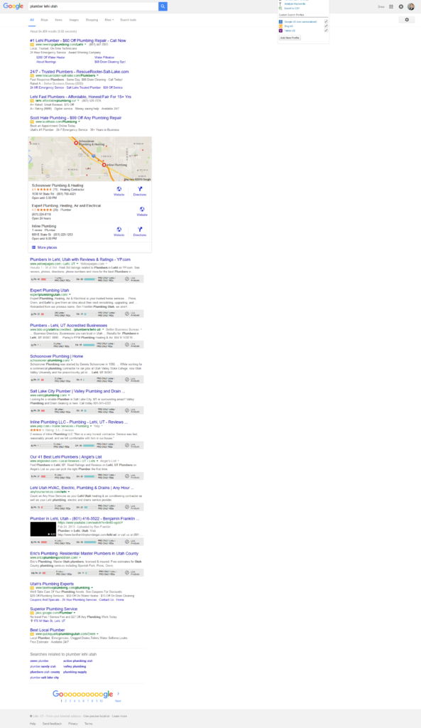
In February 2016, Google made their latest change to be more mobile-focused. Google removed ads from the right side of the screen and repositioned some of them at the top and bottom of the search results.

The most glaring aspect of the latest change is the vertical nature of the search results. The SERP (search engine results page) is now longer from top to bottom with little going on from left to right. Mobile devices also use a top-to-bottom viewing pattern since scrolling left to right on a mobile device is cumbersome and annoying.
Results
So is there a correlation between Google updates and the increase in mobile use?
Google has always been the best at providing users with what they want. They have huge amounts of data they look through, and they make decisions based on the way users behave.
I think Google knew these changes would impact user experience—even if they didn’t know the changes directly impacted mobile usage. For example, Carousel, one of the first updates, used a horizontal list of local businesses. Contrast that result with today’s Local 3-Pack with no ads on the side. The results have changed to a more mobile-friendly visual.
As early as 2013, Google has been concerned about providing better mobile results. The past local changes were, as future changes will be, influenced by users and what they want. As more and more users perform searches on the mobile devices, users will want mobile-friendly search results.
Do you agree with my assessment of Google updates? Let me know what you think and if I missed any updates in the comments. Also, hit me up on Google+ to stay up to date with the latest Google and SEO news!
