Boosting Sales: What Are Dedicated Landing Pages and How to Create Them

The world of digital is changing.
Not only are our internet speeds increasing, not only are more people plugged in practically 24/7, not only are your competitors getting better at digital marketing – but the customers are getting smarter and more specific as well.
The more the world of online sales evolves, the more important it becomes to stand out, do something different, and provide real value to your visitors.
Let’s explore one of the tactics you can (and should) employ to make sure your conversion rates keep rising while your customer satisfaction rates keep them company. We’re going to deep dive into the world of landing pages.
What even are dedicated landing pages?
Excellent question.
Dedicated landing pages are landing pages that have been created in order to target a specific set of customers: a specific market segment, a group of visitors with similar interests, leads sharing the same problems.
If you were to use a single landing page to attract all of the different target audiences you’re trying to appeal to, your conversion rates would likely remain lower than if you were to use a dedicated landing page for different groups or niches.
For example, if your product appeals both to students, freelancers, and small businesses, you can’t expect the same copy, the same CTA, and the same imagery to convert them all.
Another major benefit of dedicated landing pages is that you are better able to measure progress, track key KPIs, and tweak your campaigns. They also make you privy to incredibly valuable information, like your most profitable marketing channel, your most loyal customer segment, and so on.
Granted, not every business will be able to create a dedicated landing page, and some may even have no need for one. On the other hand, if you have glimpsed the benefits from what we have just stated above, and would like to start segmenting your sales to your advantage, let’s have a look at some dedicated landing page examples, and what you can take away from them:
Create one page that says it all
What we’re about to say may sound counterintuitive, but hear us out.
While you’re creating your dedicated landing pages and segmenting them so that they can appeal to different audiences, create one page that will detail all of the features and benefits of your product or service.
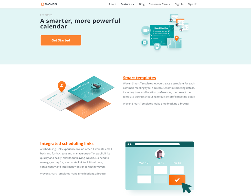
Here is this example from Woven:

Their features page briefly touches on everything they cover in detail elsewhere, and this page is great for attracting a more general audience (when you are unsure who you might hook). It helps visitors summarize what you offer at a glance, and it is also a good page to try and rank.
This page is also an excellent starting point for building your other (dedicated) pages.
Images speak louder than words
Finding the right image for your landing page is sometimes a challenge – but if you have a clear product to show, it’s always the best option to go for. Even if there’s more than one product to choose from, an accurate representation will often do more for your conversions than a whole lot of witty copy.
Here’s this page from Taster’s Club. True, the bourbon you see in the hero section of the landing page may not be the bourbon you actually get – but that is beside the point. They have done a good job of grabbing your attention, showing you what kind of product you can expect, and the imagery blends nicely with the page as well as the rest of the website.
Speak to your audience
The key to building dedicated landing pages that actually boost conversions is speaking the language of your target audience. You can segment all you want; if the copy you write doesn’t target the pain points of the leads you’re trying to attract with a given page, it will not work.
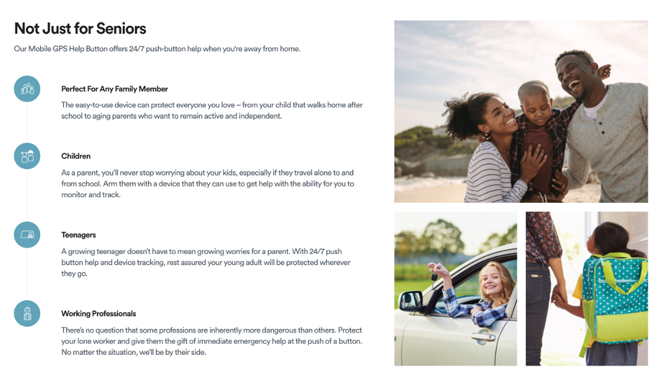
Let’s look at an example from Bay Alarm Medical:

They sell medical alert systems, and their main target market would, in theory, be the elderly. However, their products can be used to keep track of any family member (like your kids on their way to school). And they have created a dedicated landing page that no longer speaks only to seniors, but to anyone looking to ensure their family’s safety.
Educate your leads
Sometimes you can immediately tell how to use a product. You don’t need to provide any extra guidelines or instructions. At other times, you need to provide a detailed user manual just to get people started.
You might think that a product like Slack falls into the first category – what can be so hard about a chat application?
However, the people behind Slack have done a great job with their dedicated landing pages. Not only have they segmented them based on industry, but their pages feature a great addition: access to their content.
Every dedicated landing page provides a section where you can read up on the best way to use their service for your specific needs. This means that even if the page copy and imagery itself doesn’t convert you, they’re providing additional resources that just might.
Showcase different possibilities
What if you have a product that can appeal to all kinds of industries, yet some of them may never have considered using it?
A dedicated landing page like this one from Forms on Fire is a great way to list all the different cases and niches where you may be able to offer a helpful solution.

By listing all kinds of businesses that might benefit from testing out your offer, you’re not only enforcing the wide range of its applicability. But you’re also potentially drawing in leads that may not have thought about you in the first place.
Make signing up as easy as possible
If you need your customers to fill out a form or provide some kind of information to get access to your service, making this as straightforward as is humanly and digitally possible should be your number one priority. Nobody likes to spend 15 minutes filling out forms.
Lyft has done a good job here. Both their driver and rider applications are incredibly simple, and initially require just one piece of information from users. That way, you will be well on your way to signing up before you realize how much time you have spent with all kinds of forms.
Social proof and testimonials to provide value
Social proof and customer testimonials are a tried and tested way to show your new leads how happy your converting visitors are. Not only do they provide additional value. But they are also great at establishing instant trust, helping you forge that vital bond between you and a new lead.
A good example of this is demonstrated by inFlow, a B2B inventory management software company that works with major brands. Even though they have clearly worked with some huge names across all kinds of industries, they’ve chosen not to push this fact on their visitors. They have listed their clients smartly, closer to the bottom of the page, below a section that already emphasizes the value of their solutions.
That way, they let the product speak for itself first, and then reinforce the value by calling on their client list.
Make it personal
If you can make your product or service personalized, you should, by all means, do it. Whether it’s a choice of packaging, a choice of color, or anything else you can create in different varieties. Offering your leads a chance to choose and personalize their experience is a great conversion booster.
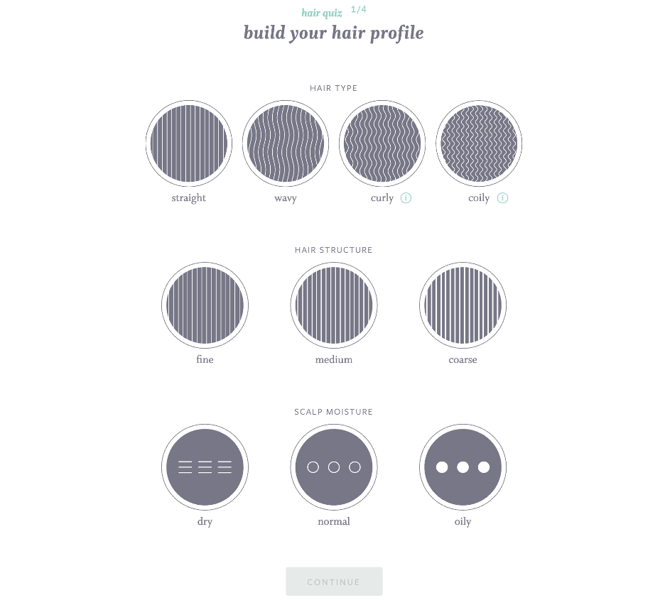
Here is a great example from Function of Beauty, who make fully personalized shampoo and conditioner:

They let you choose every single aspect of the product you’re buying, from the ingredients and fragrance strength to the formula name that will be printed on the bottle. It’s not only about offering a product that fulfills the specific needs of each customer. With this approach, the brand does its best to make its customers feel valued. It’s a shopping experience you can never get at another store, where you can only shop off the shelf.
Final thoughts
Creating a dedicated landing page will often take more time than creating a garden variety landing page (considering all the segmentation, research, and copywriting that needs to go into it). But the return you will see on your initial investment can’t be overlooked.
Make sure you invest plenty of thought and consideration in their creation, though, because they need to be more than just different. You’ll want to make them truly appealing and customized, rather than just varied.

